How to Create Fully Functional Custom Network Maps in PRTG 26.1.116 (A Complete Guide)
Table of Contents
Introduction
PRTG Maps vs PRTG Dashboards
Benefits of PRTG Maps
Overview of Default PRTG Map Types
Getting Started with PRTG Maps
Creating Different Types of Custom Maps
Deep Dive: Using Map Designer Effectively
Custom Map Objects
Using Custom HTML in PRTG Maps
Integrating the PRTG API with Maps
Map Nesting and Modular Design
Checklist: Building a PRTG Map
Conclusion
FAQs
Introduction
In modern IT environments, visibility is everything. As networks grow more ever more complex — spanning on-premises infrastructure, cloud services, and distributed locations — having a clear, real-time view of system health becomes critical. This is where Paessler’s PRTG Network Monitor stands out, offering powerful monitoring capabilities combined with flexible visualisation tools.
Amongst these, PRTG Maps provide one of the most versatile ways to present monitoring data. Unlike standard dashboards, maps allow you to build fully customised, interactive views of your infrastructure — tailored to your organisation’s specific needs. Whether you’re designing a high-level executive overview, a detailed network topology, or a large-scale NOC display, PRTG Maps give you complete control over how data is displayed and consumed.
In this guide, we’ll explore how to create fully functional custom maps in PRTG — from understanding the different map types available to mastering the Map Designer, integrating custom elements, and leveraging the PRTG API. By the end, you’ll have the knowledge needed to design clear, effective, and visually engaging monitoring maps that enhance both visibility and operational efficiency.
Before diving into building maps, it’s important to understand the distinction between PRTG Maps and PRTG Dashboards, as they are often used interchangeably but serve different purposes.
PRTG Maps vs PRTG Dashboards
PRTG Dashboards are typically pre-configured, high-level visual summaries of the monitoring environment. They present key metrics, alerts, and summaries in a structured layout with minimal customization required. Dashboards are ideal for quick insights and executive- level overviews.
PRTG Maps, on the other hand, are highly customizable visualizations that allow the design of customised monitoring views from scratch. They can include maps, floor plans, device diagrams, status indicators, graphs, and even custom HTML elements. Maps are interactive and flexible, making them ideal for network operations centres (NOCs), wall displays, and deep operational monitoring.
Benefits of PRTG Maps
PRTG Maps provide several advantages for network monitoring teams, namely:
- Full Customization – Design layouts tailored to the specific infrastructure.
- Visual Context – Overlay sensors and devices on geographical maps or floor plans.
- Real-Time Status – Display live monitoring data with color-coded indicators.
- Centralized Monitoring – Combine multiple systems into one view.
- User-Specific Views – Create maps for different teams (network, server, application).
- Interactive Navigation – Drill down into devices and sensors directly.
Overview of Default PRTG Map Types
PRTG offers several built-in map types and templates:
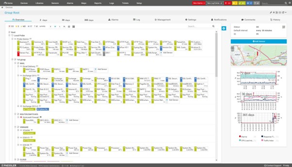
1. Device Tree Maps
Description: Displays the hierarchical structure of the monitored devices.
Benefits:
- Easy to understand
- Auto-generated from device tree
Disadvantages:
- Limited visual customization
- Not suitable for NOC displays
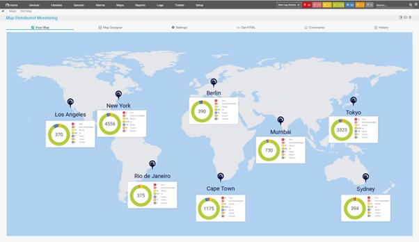
2. Geo Maps
Description: Places devices on a world map using geographic coordinates.
Benefits:
- Ideal for distributed environments
- Great for WAN monitoring
Disadvantages:
- Requires accurate geolocation data
- Limited indoor relevance
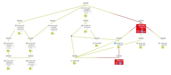
3. Topology Maps
Description: Represents network relationships and dependencies.
Benefits:
- Shows connectivity clearly
- Useful for troubleshooting
Disadvantages:
- Can become cluttered in large networks
- Requires manual organization
4. Dashboard-Style Maps
Description: Combines charts, gauges, and status widgets.
Benefits:
- Executive-friendly
- Easy to interpret
Disadvantages:
- Less detailed
- Limited interactivity
Getting Started with PRTG Maps
Below is the step-by-step process for creating a custom PRTG map:
Step 1: Access the Map Designer
- Log into PRTG Web Interface
- Navigate to Maps
- Click Add Map
- Choose Custom Map
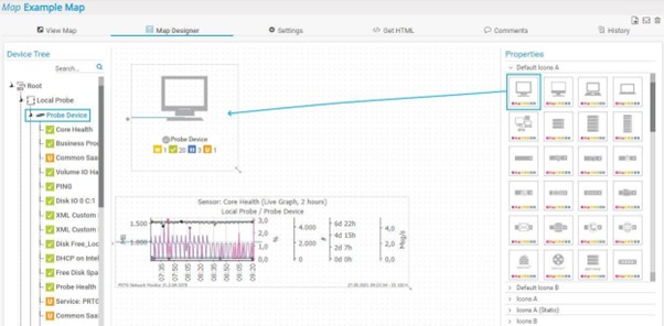
Step 2: Open Map Designer
Click Edit Map to launch the Map Designer.
Step 3: Add Map Objects
From the right-hand panel, drag and drop elements such as:
- Device status icons
- Sensor gauges
- Graphs
- Tables
- Text labels
Step 4: Configure Objects
Click on any object to configure:
- Data source (sensor/device)
- Display format
- Refresh rate
- Colour thresholds
Step 5: Arrange Layout
Organize the objects logically:
- Group by location or function
- Align elements for readability
- Use spacing and backgrounds
Step 6: Save and Publish
Click Save and then configure sharing:
- Public URL
- User access permissions
- Auto-refresh settings
Creating Different Types of Custom Maps
Based on the use of a map, there are a few different types of custom map available:
1. Infrastructure Overview Map
- Combine device status icons
- Add traffic graphs
- Include uptime indicators
2. Network Topology Map
- Use connection lines (manual)
- Place switches, routers, firewalls
- Add link utilization sensors
3. NOC Wall Display Map
- Use large fonts and icons
- Highlight critical alerts
- Minimize clutter
4. Geographic Map
- Upload a map background
- Place devices based on location
- Use colour coded status indicators
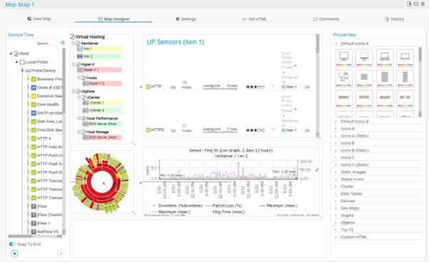
Deep Dive: Using Map Designer Effectively
Map Designer is the core tool for building maps in PRTG and some key tips for the most effective use of it are:
- Use grid alignment for clean layouts
- Leverage layers for complex maps
- Use background images (floor plans, diagrams)
- Keep consistent colour schemes
Custom Map Objects
Various types of reusable components can be created within PRTG maps:
- Custom status panels
- Pre-configured sensor groups
- Branded UI elements
Using Custom HTML in PRTG Maps
PRTG allows embedding HTML for advanced customization where examples include:
- Custom CSS styling
- Embedded charts
- External data integrations
Example HTML Snippet:
<div style="font-size:20px; color:red;">
  Critical Alerts: {sensorstatus}
</div>
Benefits:
- Unlimited flexibility
- Integration with external tools
Risks:
- Requires HTML/CSS knowledge
- Potential for layout issues
Integrating the PRTG API with Maps
The PRTG API enables dynamic data integration.
Use Cases include:
- Pull external metrics into maps
- Automatic map updates
- Integration with third-party systems
Example API Call:
/api/getsensordetails.json?id=1234
Benefits:
- Real-time dynamic content
- Automation capabilities
Considerations:
- Requires scripting knowledge
- Authentication management needed
Map Nesting and Modular Design
Map nesting allows embedding of one map inside another.
Benefits:
- Modular design
- Reusability
- Simplified management
Example:
- Main map = Global overview
- Nested maps = Regional views
Checklist: Building a PRTG Map
Prerequisites
- Fully configured PRTG environment
- Devices and sensors already added
- User permissions set
Steps Checklist
- Define map purpose
- Select appropriate map type
- Open Map Designer
- Add relevant objects
- Configure data sources
- Optimize layout
- Add custom HTML (optional)
- Test functionality
- Publish and share
Conclusion
PRTG Maps are one of the most powerful features available for infrastructure monitoring. Unlike static dashboards, maps allow you to build highly customized, interactive, and visually intuitive monitoring environments tailored to your organization’s needs. By leveraging Map Designer, custom objects, HTML, and the PRTG API, you can create anything from simple status boards to complex, enterprise-grade monitoring systems. With thoughtful design and proper planning, PRTG Maps can significantly enhance visibility, reduce response times, and improve operational efficiency.
FAQs
1. What is the main purpose of PRTG Maps?
To provide customizable, visual representations of monitoring data in real time.
2. Can I share PRTG Maps publicly?
Yes, using public URLs with appropriate access controls.
3. Do PRTG Maps support real-time updates?
Yes, they auto-refresh based on configured intervals.
4. Can I integrate external data into PRTG Maps?
Yes, using the PRTG API and custom HTML.
5. Are PRTG Maps suitable for NOC displays?
Absolutely—they are commonly used for large-screen monitoring.